Amazon receives nearly 200 million unique website visitors each month in the US alone. There are millions of customers entering searches into the Amazon search bar and making purchases every day.
That’s a whole lot of opportunity for third party sellers.
How can you really take advantage of this opportunity and maximize your sales? Your product launch strategy, the health of your account, how you manage inventory, your seller ratings and your product reviews can all come into play.
But there’s one simple thing at the center of it all: your Amazon product pages, or product detail pages as Amazon calls them.
These are the pages that actually make the sales. You need to make sure that customers are finding your pages, and once those pages have been found, that they convert well.
Here are the top tricks to mastering Amazon product pages.
Table of Contents
ToggleOverall messaging
What makes your product unique? To stand out in the sea of products on Amazon, you must have an overall message that you are trying to convey.
Start off with a core value proposition
Before moving onto any other optimization strategies, you must first ensure that you have a solid foundation. Your value proposition or unique selling point (USP) are what differentiate your product from others found on Amazon.
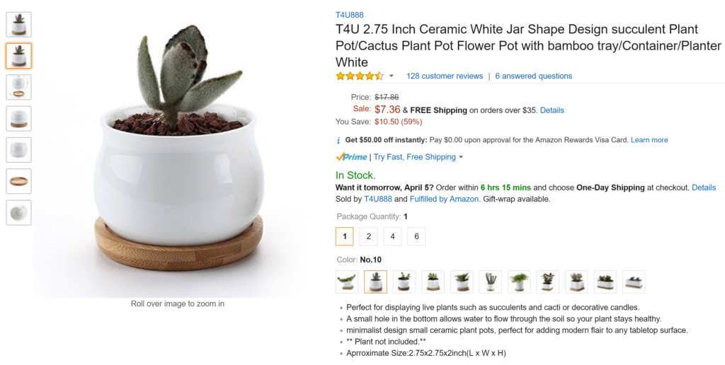
Consider this flower pot:

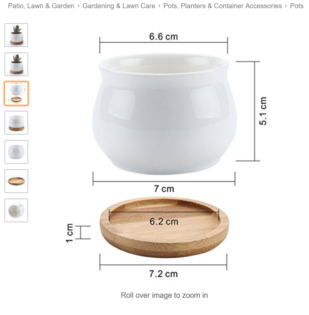
Everything about this page is selling what is unique about the planter—the fact that it is minimalist and modern.
Succulents are wildly trendy in minimalist interior design right now, so it makes sense to include a succulent in the photo and in the title and description. This product page is very clear about appealing to the target buyer. It’s showing a trend-right product that’s modern but earthy, and it appeals to its buyer with the right images and words.

Without having a clear understanding of what’s special about your product and why someone would choose it over other similar offerings, it’s impossible to further optimize your page, so make this process the first step.
Titles
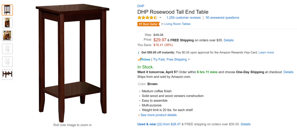
Titles are critical to getting your product in search results pages. And once it actually shows up on the search result page, your title needs to entice buyers to click through and view the product listing.
Write a strategic product title
There is a very basic formula provided by Amazon for what product titles should look like in every category.
In your category, this formula might look something like:
Brand + Line + Size + Product Type + Color
You absolutely should include the basic information that users will type in when searching for your product, but you should also be a bit more creative to really drive your messaging strategy home. Some winning ideas are to include a pain point that your product solves, list out a couple different use cases, and showcase awards or innovative qualities.
Include your most important keywords
To avoid keyword stuffing your product title, you should include only the most relevant terms. This could be an adjective, like “modern” or it could be a use case like “camping.” It will take testing to discover which keywords payoff the most (Is it “minimalist” or “modern”? Is it “camping” or “backpacking”?), but the point is that you can’t possibly fit every relevant keyword in the title, so only include the top few.
Watch the length
Are you adding so much information in your product title that it is overwhelmingly long? You may have heard of (or been guilty of writing) product titles that are 500 characters long. These are a no-no because customers can’t possibly read all of that information when it’s crammed in one long string.
Get opinions from friends and family about how easy it is to read your description. Choose clarity and brevity over any attempt to maximize the space. And if you do want to include extra information, try using hyphens, dashes, or bars to help with readability:

Photographs
How you visually present your product is incredibly important for increasing conversions.
Include 5-6 informative photos
Having high quality photos isn’t enough. You need to make sure that your group of photos strategically covers most questions that customers might ask. What does it look like from the bottom? From the side? For jewelry, the main question might be, how big is that earring in relation to an ear?
Spend time researching what your customers need to know and figure out how you can answer those questions with photos.

Include photographs of product components or bonus items
Maybe you’re selling a curling iron that comes with a heat protectant bag, or a backgammon set that has a really nice velvet box. If you have some star components or bonus items as part of your product, be sure to photograph them individually as well as with the main product, because these items can be huge differentiators. Fun extras prompt customers to buy.
Make sure photos are at least 1000 x 1000 pixels
“Roll over image to zoom in.”
Don’t assume that all your images will include that text on the bottom. For this feature to work properly, your images have to be large enough. And since Amazon claims that the zooming feature really does impact sales, you should always double check.
Description and bullet points
This is the meat and potatoes of your page. The description and bullet points are where you give all the extra information required both by Amazon’s search engine and curious customers. Here’s how to make them shine.
Keep bullet points short
One common mistake is turning bullet points into paragraphs. Writing really long text in the bulleted lists means that your product page is hard to read and people will get bored and click the back arrow. But if you keep the bullet points short and snappy, customers will be intrigued enough to scroll down for any other information they made need.

Add secondary keywords to description
You know those keywords that didn’t make the cut for your title? The description is a great place to put them, so long as you work them in smoothly and don’t provide too much information to the customer. Let them know other ways the product can be used by including those extra use cases, but don’t be selfish and drone on with large chunks of text.
Clarify and hone in on your USP
As mentioned with the minimalist succulent pot, your entire page should drive home your USP. Double check that your product description and bullet points…
- Do not lack the unique product messaging
- Do not compete with, water down, or go directly against the unique product messaging
Other search considerations
Amazon SEO isn’t just about keywords on the page. There are things on the backend that you need to consider as well.
Add search terms correctly
Amazon is not Google, so it’s important to understand that the best practices for tagging search terms will be different. You can find the guidelines for filling out the search terms fields for each product here in Seller Central. One example tip is that while you don’t need to include misspelled words, you DO need to include correct spelling variations.
Fill out as many product fields as possible
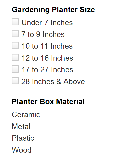
The product fields that you fill out (such as color, material etc.) are partly used to help customers filter out results in the search page. Not filling these out means NOT showing up for customers! So fill out everything you can for every product.

Amazon product page optimization is a continuous task. You have to stay on the lookout for new strategies, implement the right ones, and then wait long enough to test the results so you can see what’s working. Have we missed any of your go-to optimization tricks? Let us know in the comments below.
To learn more about our FBA reimbursement solution, click here.
Sign Up for Refunds Manager
Stay strategic on Amazon! Get new blog posts sent to you via email:
[email-subscribers namefield=”YES” desc=”” group=”Public”]


