Have you ever noticed that some Amazon product pages look…really professional? Nice images, quotes, charts…all sorts of details that turn the basic product description section into what’s effectively a landing page.
What you’re seeing is enhanced content, which is available for you to create for your own product in two ways:
- A+ Content is available through Vendor Central at the price of $600 per page
- Enhanced brand content is available for free once your brand is registered with Amazon
Once you’ve accessed the ability to create enhanced content, the next step of course, is to actually create your new page.
Since Amazon claims that these pages can increase conversions by 3 to 10%, you’ll want to do the best job you possibly can.
Table of Contents
ToggleHow to create enhanced brand content
The “how” is the easy part. Once you’re private brand is registered, simply:
- Login to Seller Central
- Navigate from Advertising to Enhanced Brand Content
- Choose a template
- Insert your content (images and text)
The “what” is much harder. You’ll want the right keywords, the right marketing message to differentiate your offering, and images that seal the deal.
Let’s take a look at some winning examples to get the creative juices flowing.
Examples of enhanced content (and what we can learn from them)
These four examples from different product categories all have a unique lesson to teach.
Show product options and what makes them special
Check out this rose scented whipped organic shea butter from SHEA brand:
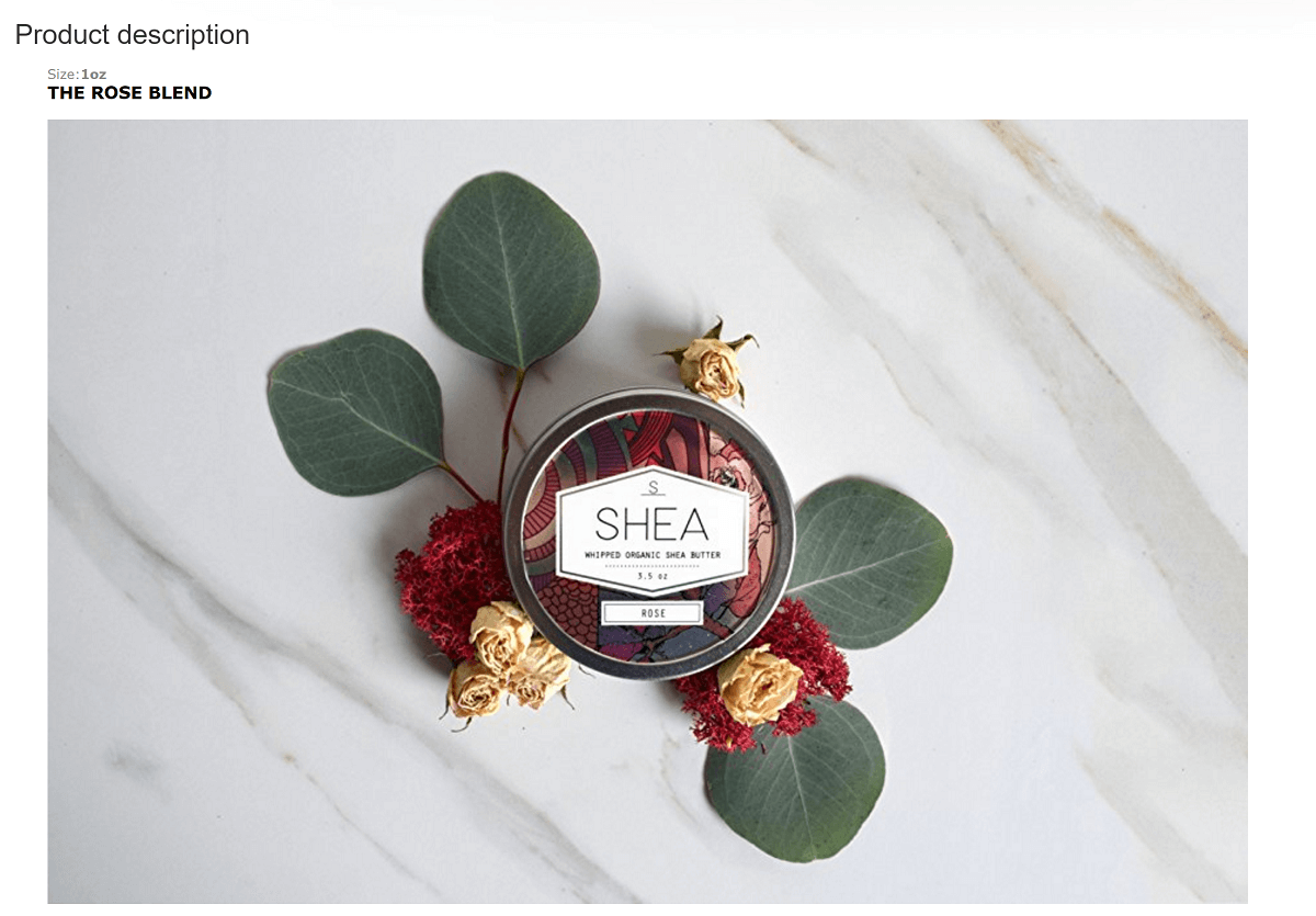
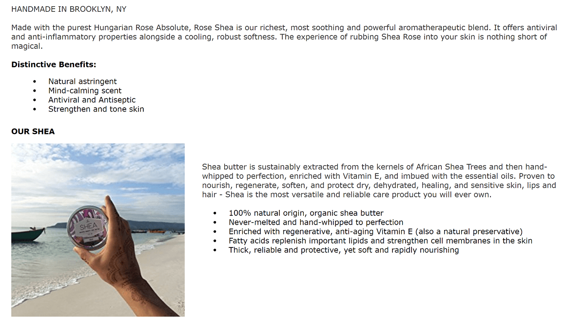
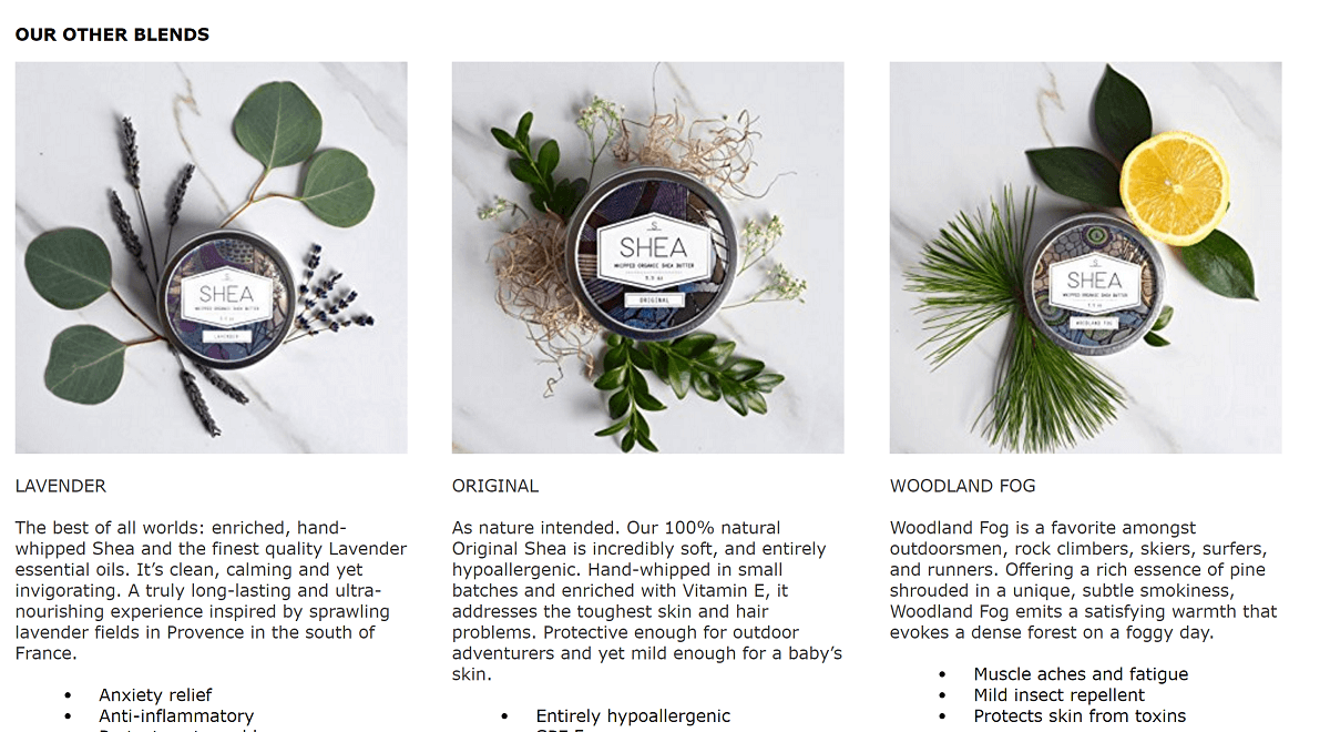
Even though the brand can’t include links to their other products (shea butter with essential oils other than rose), they’ve still found a way to include them in their enhanced product description.
Each scent’s listing has it’s own picture taken on a marble surface as the header image and then has a lifestyle image below, followed by the three other options.
Including these different scent options on the product page is pretty smart, for a few reasons:
- Gives additional visual content that appeals to the buyer
- Shows the creativity of the brand
- Lets customers know of other scents they might prefer
If you have a product whose variations can be shown in a way that serves the customer and speaks to the experience of your brand, then this is an idea to steal.
Tell your brand’s story and show off nice packaging
These salt and pepper mills from Willow & Everett stand out in great lifestyle photography shots:
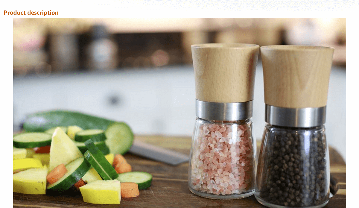
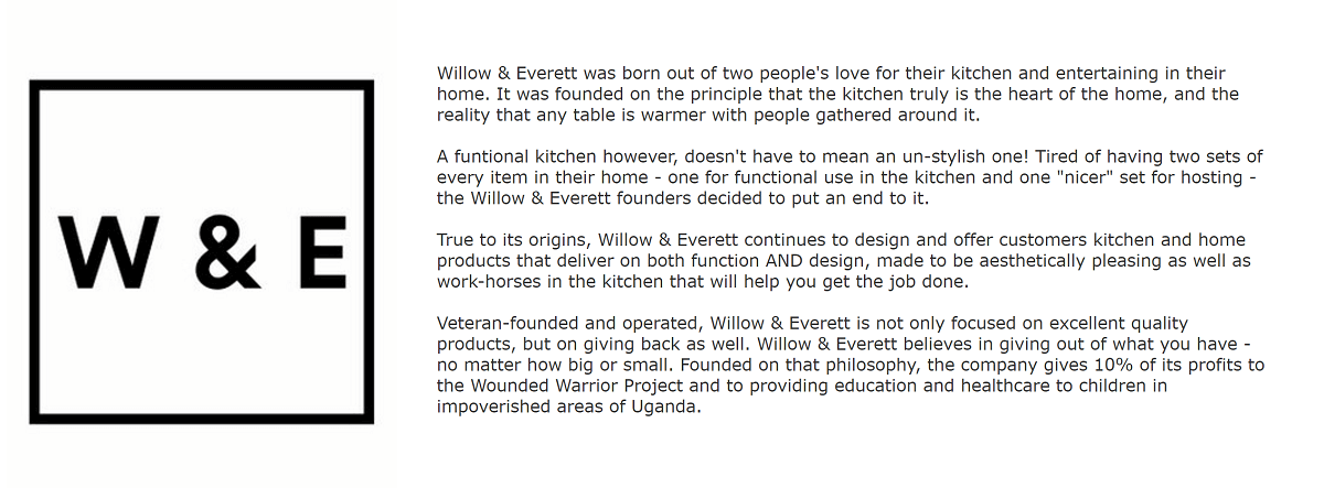
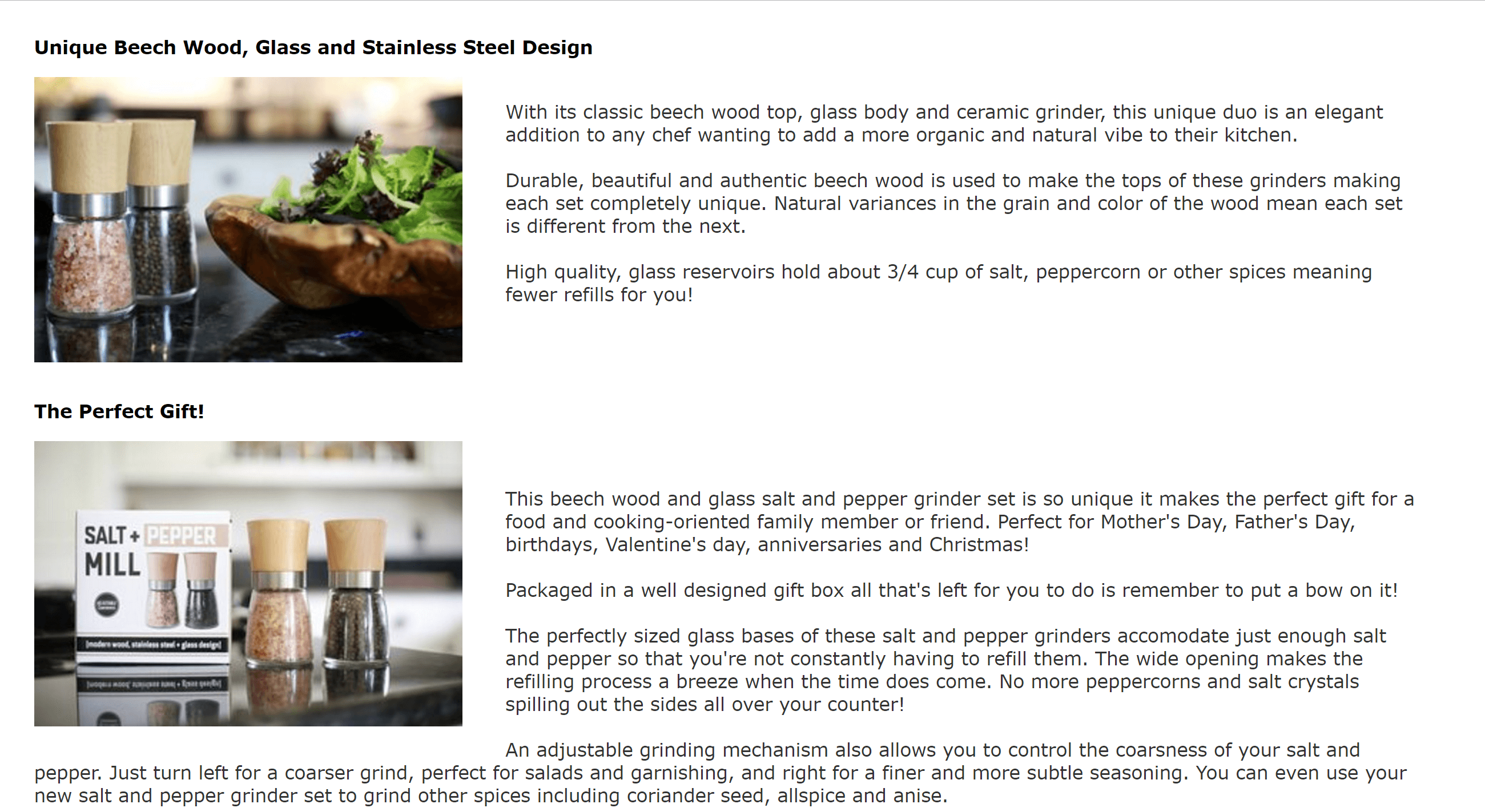
Besides really great lifestyle photography, there are a few other things that private label sellers can learn from this example of enhanced brand content.
Next to the logo, you’ll see the brand’s story. It tells that the inspiration came from the desire to have mills that were functional and attractive—so it wouldn’t be necessary to own two sets. The brand story does what any good brand story should do: tell the customer how it all relates to them.
Secondly, they make the point to show that this product makes an excellent gift and that it comes inside of cool, modern packaging.
Including himalayan pink sea salt (rather than white salt) is the extra touch that gives this product a trendy edge.
Help customers understand an innovative product
Some of the best products don’t look like what people assume. If you saw this baby bath without a wet and sudsy baby inside, you wouldn’t know it was a baby bath.
Enhanced branded content is the perfect opportunity to show customers what your innovative product is used for.
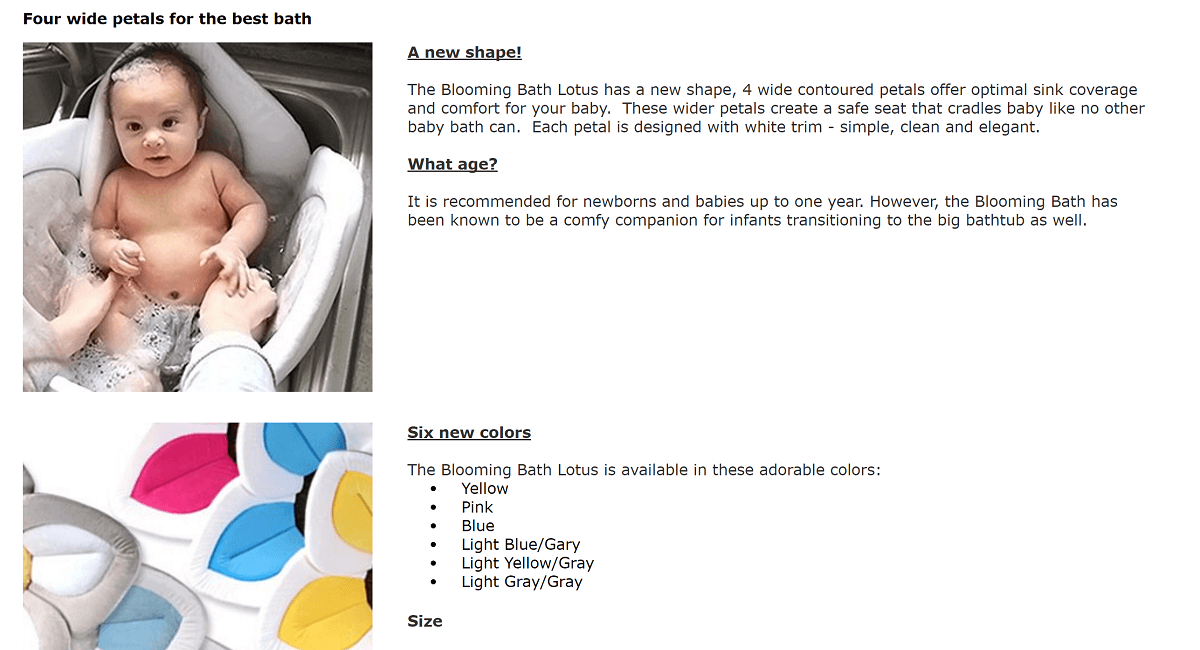
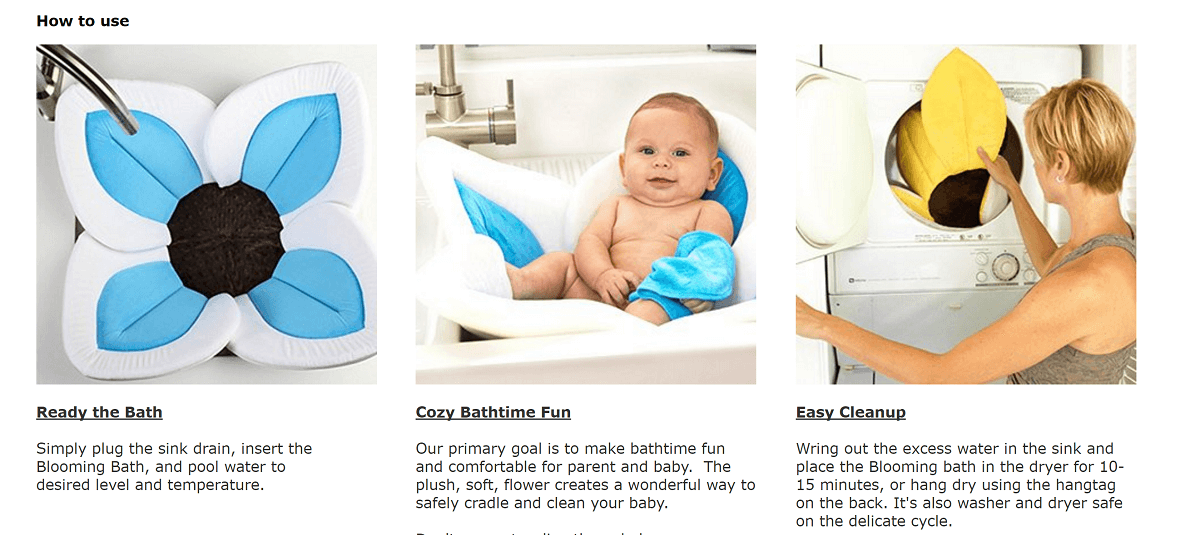
In addition to showing the product in use and making it clear that this baby bath was designed for ultimum comfort, this product page also shows off features that are important to parents:
- Fun color options
- Easy to clean
- Safe
Your enhanced content should contextualize your product while ticking off any boxes to answer the questions that customers might have.
Keep things simple and show off important specs
Not every enhanced content description needs to be a big creative project. Something is better than nothing, and you have to start somewhere.
This duo iphone charger and speaker keeps things simple:
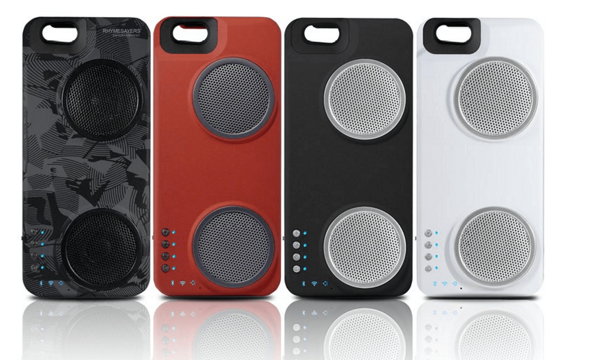
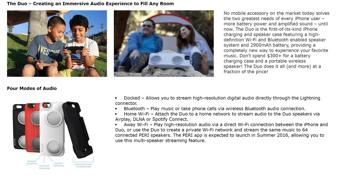

They start off by showing color options, and then use lifestyle contextualized images that look high quality, but not necessarily professional. Who knows, maybe they just grabbed some friends, bought a nice camera, and went outside for a quick DIY photoshoot?
The page also details important specs and lets customers know that the product was built to work seamlessly with iPhones.
The key thing to learn from this example is to use images you already have. Don’t wait to create enhanced brand content until you do a brand new photo shoot or hire a graphic designer. Pull from the 5-7 product images that are already on your page.
People are used to scrolling. Give them the information they need in an easy-to-digest format.
Let us know your thoughts on designing enhanced brand content below!
Sign Up for Refunds Manager
Stay strategic on Amazon! Get new blog posts sent to you via email:
[email-subscribers namefield=”YES” desc=”” group=”Public”]


